Color Wheel
- 4.6
- Rating
- 50.00K
- Installs
- $1.99
- Price
 Analysis by App-foxy
Choosing colors sounds simple until a project needs more than a quick guess. A background can look fine on one screen and muddy on another, a supposedly warm accent can overpower the rest of a layout, and a palette that feels balanced in isolation may fail completely beside real text or imagery. I found Color Wheel most useful as a focused companion for those decisions: it brings several kinds of color wheels into one small art and design tool instead of asking me to build every relationship from scratch.
This is an app rather than a full drawing suite, and that distinction matters. I would not install it expecting brushes, layers, photo editing, or a complete illustration workspace. Its purpose is narrower and more practical: helping me explore color relationships, compare combinations, and make a more deliberate choice before I commit to a design. Roman Sevastianov keeps the idea straightforward, which makes the app approachable for beginners while still giving experienced users a useful place to test a palette.
How I use Color Wheel from a blank idea to a usable palette
My baseline workflow starts with the color that cannot change. That might be a brand color, a wall color in a room illustration, a dominant shade in a poster, or the tone I already chose for a button. Rather than spinning through random colors, I treat that starting point as an anchor and use the wheel to inspect nearby and opposing relationships. This simple habit makes the app more useful than a picker that merely shows isolated swatches.
You May Also Like

 Blood Strike: 2.5 Anniversary
Blood Strike’s Loadouts Turn Every Drop Into a Tactical Gamble
A close look at Blood Strike’s custom loadouts: how fast access to signature weapons reshapes its battle royale rhythm, rewards preparation, and narrows the gap between fights.

 Pandora - Music & Podcasts
Pandora’s Music Is Easy to Start, but Harder to Recover
Pandora’s strength is its low-effort path from a seed to a station. Its weak spot is how much confidence it asks you to place in connection, setup, and quiet recovery.

 8 Ball Pool
 Is Built on Rivalries, Rematches, and Routine
A close look at the rivalries, rematches, shared routines, and unanswered safety questions that turn a quick pool match into a persistent mobile community.

 Samsung Music
’s Quiet Strength Is Playing What You Already Own
Its reach comes less from spectacle than from dependable access to a personal library. That simplicity is both the app’s strongest retention engine and its ceiling.

 AccuWeather: Weather Radar
AccuWeather Review: A Quick, Clear Forecast for Everyday Decisions
For everyday plans, the best forecast is the one you can understand quickly. AccuWeather makes rain timing, radar, and local conditions easy to act on, with a few trade-offs.

 Hill Climb Racing
Why Hill Climb Racing Still Turns Crashes Into One More Run
A tiny car, a bumpy hill and one more upgrade: Hill Climb Racing keeps resurfacing because its simple chaos makes every near-miss feel personal.
More From Our News Desk
View All News


For a new illustration, I usually begin with a broad question: do I want harmony, contrast, or a deliberately unusual combination? The classic wheel is helpful when I need to understand the basic relationship between hues. The abstract options are more interesting when I am trying to escape predictable palettes. I do not assume that the most dramatic result is automatically the best one; I compare it against the intended mood and against the amount of text or detail the final design will contain.
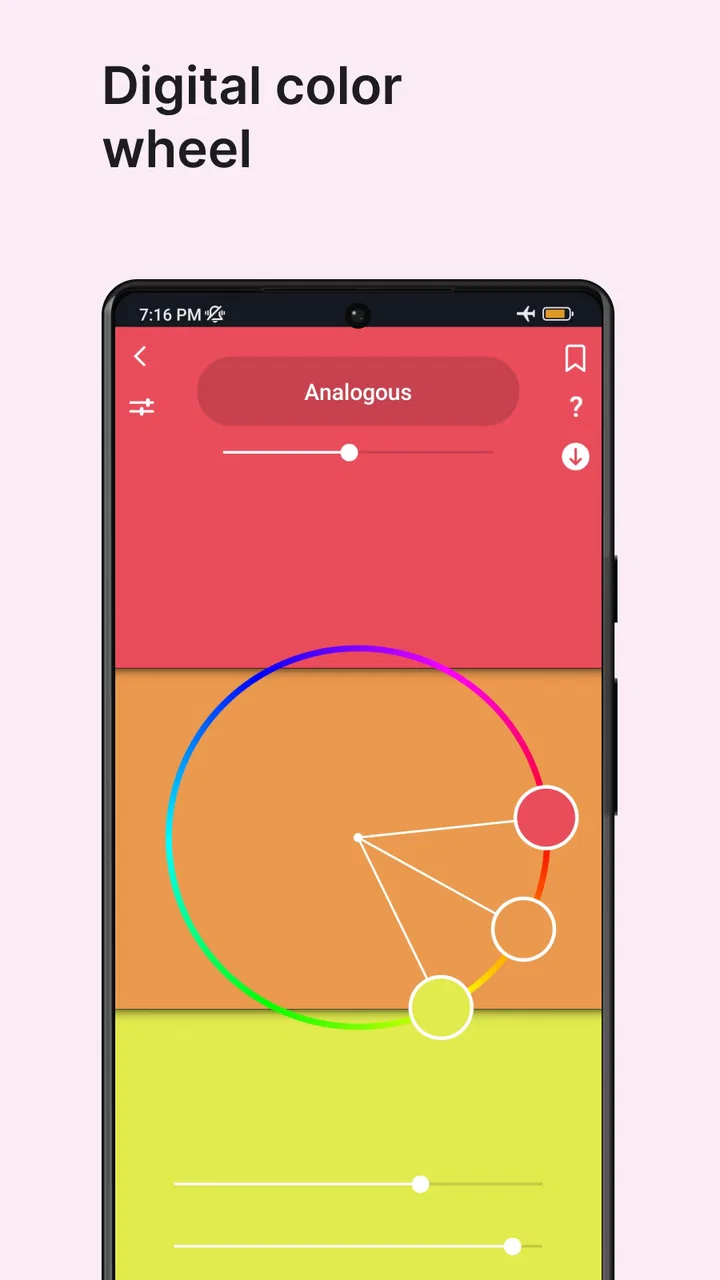
The digital side of the app fits a different part of the process. I use it when the palette must feel precise on a screen rather than simply pleasant on paper. That distinction is easy to overlook. A color can appear attractive as a large circle but become tiring when repeated across a user interface. I therefore test a potential main color with a quieter supporting shade and a restrained accent, instead of selecting every color at equal intensity.
A realistic everyday example is preparing a small social graphic for an event. I might have a fixed logo color and need a background, heading color, and highlight. I first explore complementary relationships for visibility, then check analogous choices for a calmer version. After that, I reduce the number of strong colors rather than filling the design with every appealing option. The app does not make the design for me, but it shortens the uncertain part of the decision.
That is where the tool earns its place. It is not trying to replace judgment. It gives me a visual structure for judgment, which is especially valuable when I am tired of opening a general design application, creating temporary shapes, and deleting them repeatedly. I can think about relationships first and production later.
What the different wheel types change in practice
The classic approach is the easiest entry point. It helps explain why two colors feel related and why another pair creates tension. I would recommend starting there if color theory is still unfamiliar, because it gives a clear visual map instead of presenting an unexplained list of suggested combinations.
The digital wheels are better suited to screen-oriented work, where small shifts can affect readability and emphasis. I pay attention to whether a proposed accent remains distinct from the background at the size I will actually use. A wheel can reveal a relationship, but it cannot judge the final typography, image compression, or surrounding interface. I still move the chosen colors into the actual project before calling the palette finished.
The abstract options are where I see the most creative value. They encourage combinations that may not emerge from a strict textbook exercise. I use them as a source of prompts rather than rules: choose an unexpected pairing, then ask which color should dominate and which should appear only in small amounts. This prevents an experimental palette from turning into visual noise.
One useful technique is to save the first attractive result mentally as a reference, then keep exploring. The first combination often feels exciting because it is new, not because it is suitable. Comparing several directions helps me separate a genuine solution from a momentary preference. Color Wheel is particularly good at this exploratory stage because it keeps the focus on the palette rather than on unrelated editing controls.
Settings and habits worth checking before serious work
I would spend a few minutes exploring the available controls before using the app for a client piece or a finished illustration. The important question is not simply which wheel looks nicest, but which view gives me the clearest answer for the task in front of me. A beginner may prefer a direct, uncluttered wheel, while an experienced designer may get more from comparing classic and abstract approaches side by side in separate passes.
I also recommend checking how the app behaves with the device orientation, display brightness, and surrounding lighting you normally use. Color decisions are surprisingly sensitive to context. A palette selected late at night under a warm lamp may feel different the next morning. That is not a flaw unique to this application, but it is a reason to treat its output as guidance rather than absolute truth.
Another practical habit is to avoid judging a tiny accent at full-screen size only. I imagine it in its real role: a thin border, a small icon, a headline, or a large background. The same hue can succeed in one role and fail in another. The wheel helps me find the relationship, while the final scale determines whether the relationship remains useful.
Because the app is paid, I would decide whether this focused workflow matches my needs before buying it. The listed price is $1.99, which I consider reasonable for someone who regularly works with palettes, but less compelling for a person who only wants an occasional color suggestion. Free web tools can cover a quick one-off choice. The value here is having a dedicated, repeatable environment for exploring color rather than hunting through unrelated design websites.
The app is rated for Everyone, and I found its basic concept easy to understand without a technical background. It runs on Android versions from 7.0 onward, so it is not restricted to recent devices. Its current version is 1.45, and the modest scope helps it feel less intimidating than a professional design package. Still, ease of entry should not be confused with automatic expertise: the better results come from using the wheel with a clear purpose.
Faster patterns for people who use it repeatedly
Experienced users can make the process faster by adopting a fixed sequence. I start with the dominant color, inspect a calm neighboring option, inspect a contrasting option, and then choose only one accent direction to develop. This prevents endless browsing. If neither direction works, I return to the starting color and question the anchor itself instead of forcing the supporting shades to rescue it.
A second efficient pattern is to work in roles rather than names. I label colors in my head as background, primary content, secondary content, and accent. That makes it easier to reject a palette that has attractive individual colors but no clear hierarchy. A good combination is not just a collection of nice hues; it tells the viewer where to look first.
I also use the app before opening a full design program. This is a small change, but it reduces distraction. In a general editor, I can lose time adjusting shapes, searching for assets, or polishing a layout before I understand whether the colors belong together. In Color Wheel, the narrower environment encourages me to settle the palette question early.
For repeat projects, I keep a short written note outside the app describing why a palette worked: soft background, strong heading contrast, limited accent use, or suitable mood for a particular audience. The application helps with visual exploration, but a repeatable design habit needs a memory of decisions too. This is one of the trade-offs of a focused tool: it can clarify the color stage without becoming the archive for an entire project.
When I am working with an existing image, I avoid trying to match every visible color. Instead, I identify the image’s dominant feeling and use the wheel to find a supporting palette. Matching too many shades creates a busy result. A restrained selection usually gives the image more room to breathe, especially in a poster or interface where text must remain prominent.
Where the app helps, and where its limits become obvious
The biggest limitation is also the clearest boundary: a color wheel cannot evaluate a complete composition. It cannot tell me whether a font is too thin, whether an icon is confusing, or whether a photograph contains a competing focal point. It can suggest relationships, but the final decision still belongs in the real layout. Anyone looking for an all-in-one art studio should choose a broader application instead.
I would also be cautious about treating harmony labels as guarantees. A mathematically related palette may still feel wrong for a particular subject. A children’s illustration, a financial dashboard, and a quiet editorial page can use similar relationships but require very different saturation, spacing, and emphasis. I use the wheel to generate directions, then adjust the balance according to the project.
Accessibility is another reason not to stop at the wheel. Color alone should not carry every meaning in a design. If a warning is shown only through a red-green difference, some users may miss it. I would add text, icons, patterns, or other cues in the final product. The app can support a thoughtful palette, but it does not replace accessibility checks in the finished interface.
There is also a workflow limitation for teams. A designer who needs shared libraries, comments, file history, or direct collaboration will probably be better served by a larger design platform. Color Wheel feels more personal and immediate. That is excellent when I am exploring alone, but less suitable when several people must edit and approve the same color system.
Likewise, it is not the right choice if my main need is extracting colors automatically from photographs or managing production-ready brand tokens. For those jobs, a dedicated palette manager or design system tool may be more efficient. I see this app as the thinking surface before those systems, not as a replacement for them.
Even with those limits, I appreciate the discipline created by its narrower purpose. The app does not bury the color question under a large interface. When I feel stuck between several possible directions, returning to a wheel often reveals that the real problem is not a missing color but a lack of hierarchy. That is a useful insight, and it is one I would not always notice while editing the finished artwork.
Who should install it and who should skip it
I would recommend it to students learning basic color relationships, illustrators who want a quick exploration step, interface designers checking alternatives, and hobbyists who enjoy building palettes deliberately. It is also a good fit for someone who repeatedly makes small graphics and wants a consistent pre-design ritual rather than a random search for inspiration.
I would be less enthusiastic for a user who expects automatic, context-aware recommendations. If you want an app to inspect a photograph, understand the subject, verify text contrast, and export a complete design system, this is too focused. A free online wheel may also be enough if you use color tools only once or twice a year.
The audience size suggests that the app has found a real niche: it has more than fifty thousand installs and an average rating of 4.6 from around one thousand ratings. I read that as encouraging evidence of practical appeal, not as proof that every designer will love the workflow. The store record also shows seventy-nine written reviews, while the more important question for me remains whether the focused tool fits the way I make decisions.
Its release on February 29, 2020, gives it a longer presence than a brand-new experiment, and Roman Sevastianov has kept the product centered on its original idea. That focus is reassuring, although users seeking the newest collaborative or accessibility-oriented design features should compare it with more specialized modern tools before committing to a single workflow.
My verdict after building a repeatable color routine
Color Wheel is strongest when I use it as a deliberate first step, not as a final authority. It helps turn vague questions such as “what feels right?” into more useful comparisons: should the palette be calm or energetic, closely related or sharply contrasted, restrained or experimental? The collection of digital, classic, and abstract approaches gives me enough variety to explore without making the process feel like a full design course.
I like that it supports a repeatable habit. Start with the fixed color, inspect nearby and opposing relationships, assign practical roles, and test the result in the real layout. That sequence is faster than improvising inside a large editor, and it produces better decisions than choosing colors solely because they look attractive in isolation.
The trade-off is clear. This is a specialized $1.99 purchase, not a complete creative suite, and its suggestions still need human judgment, real-size testing, and accessibility awareness. If that sounds like a limitation you would resent, choose a broader design tool. If you want a compact way to think through palettes before drawing or laying out a project, I think the app is worth considering.
For me, the best reason to keep it installed is not the novelty of a color wheel. It is the small amount of friction it removes from a common creative bottleneck. When I have a starting color but no confident direction, I can explore structured alternatives, reject weak combinations sooner, and move into the actual project with a clearer plan. That makes this Art & Design app a modest but genuinely useful companion for anyone who wants color choices to feel intentional.
FAQs for Color Wheel
01What is Color Wheel, and what can I use it for?
Color Wheel is a color-selection and color-harmony app designed to help users explore, combine, and organize colors. It can be useful for graphic design, digital art, photography, interior decoration, branding, fashion, and everyday creative projects. After testing it, I found the wheel-based interface particularly helpful for comparing complementary, analogous, and other coordinated color combinations before applying them to a project.
02Is Color Wheel suitable for beginners, or do I need design experience?
The app is generally accessible to beginners because its main tools are based on visual color selection rather than complicated technical controls. You can experiment by moving around the color wheel and observing how related shades change. More experienced designers may appreciate the harmony options and color organization features, while beginners can use the app simply as an inspiration tool without needing prior knowledge of color theory.
03Does Color Wheel provide color codes for use in other apps and projects?
Color Wheel is intended to make selected colors practical beyond the app itself, so users should look for options such as HEX, RGB, or similar color values when saving or viewing a palette. These codes are useful when transferring colors into design software, websites, presentations, or editing applications. Available formats and export options may vary depending on the version and platform you install.
04Can I create and save custom color palettes in Color Wheel?
Yes, one of the most useful reasons to install Color Wheel is the ability to build color combinations around a chosen base color. You can experiment with different shades, compare harmony styles, and keep combinations that suit your project. Before downloading, check whether your device version supports the exact saving, sharing, or export features you need, as functionality can differ between updates.
05Is Color Wheel free to download, and does it contain ads or in-app purchases?
The download model for Color Wheel can depend on the Android or iOS version, developer decisions, and current store policies. Some versions may be free with advertising or optional purchases, while others may include premium tools behind a subscription or one-time payment. I recommend checking the official store listing before installing, especially the permissions, privacy information, advertisements, and details of any in-app purchases.
Pros
- Simple color selection makes it easy for beginners to explore combinations.
- Useful for choosing matching colors for digital art
- crafts
- and design projects.
- Lightweight interface opens quickly and feels responsive on most devices.
- Color values help reproduce selected shades accurately in other applications.
- Helpful visual tool for learning basic color relationships and harmony.
Cons
- Some advanced palettes and professional color-management tools may be missing.
- Color accuracy can vary between screens with different brightness or calibration.
- The interface may feel too basic for experienced graphic designers.
- Export and sharing options may be limited compared with full design software.
- Ads or premium restrictions may interrupt use
- depending on the app version.

Color Wheel
Gallery